
Discussions » Greasy Fork Feedback
text color issues in dark mode
I've fixed these issues.
I don't typically run in dark mode, so there may still be things that are unusable or look weird. If you find anything else, let me know.
great, I will. and thank you very much for offering a dark mode for us night owls and OLED users :)
I was thinking why GF looks weird. :)
Text with links is very hard to read, I prefer my own Darkmode User look. Can we have option to disable GF's dark mode?
EDIT: Or just make text with URL readable, because now it's almost unreadable for me.
I don't know how to disable the weird GF dark mode, but I am still using my GreasyFork Dark.
TimidScript's [TS] Citrus GFork still kickin' it in 2025.
last fix: https://greasyfork.org/scripts/4336-ts-citrus-gfork/discussions/69927#comment-267001
I've lightened the link text color in dark mode.
If you're not interested in running dark mode, you may be able to tell configure your browser not to tell websites that you want it.
I've fixed these issues.
I don't typically run in dark mode, so there may still be things that are unusable or look weird. If you find anything else, let me know.
The login screen and 2FA code screen have unreadable text when using dark mode
I've lightened the link text color in dark mode.
It's good now, thank you.
I've fixed these issues.
I don't typically run in dark mode, so there may still be things that are unusable or look weird. If you find anything else, let me know.
I also noticed that 'Diff selected versions' in the History tab for a script has some display issues in dark mode.
The login screen and 2FA code screen have unreadable text when using dark mode
I also noticed that 'Diff selected versions' in the History tab for a script has some display issues in dark mode.
These are fixed now.
When viewing an older version of an installed script, the warning stating you aren't viewing the latest version has white text on a yellow background, making it too hard to read

When viewing an older version of an installed script, the warning stating you aren't viewing the latest version has white text on a yellow background, making it too hard to read
Fixed.
https://greasyfork.org/en/scripts/409684-youtube-danmaku/diff?v1=1593619&v2=1460130
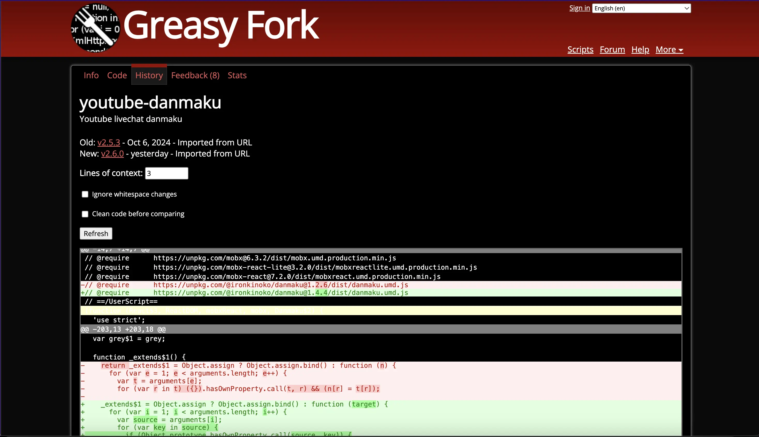
The mouse hover line background is not able to see.
The mouse hover line background is not able to see.
Fixed.
The mouse hover line background is not able to see.
Fixed.
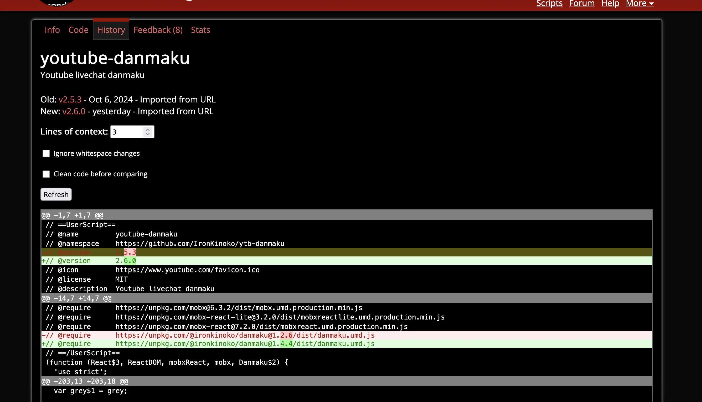
now become the issue for the hover on the red/green rows
·
GF now has a dark mode and follows the device preference, that's wonderful!
I noticed a couple of CSS issues with the text being hard or impossible to read:
^ by the end of it, <pre><code> ends up with text color #000 on a "none" background which is also interpreted as #000
I guess a
pre:has(code) { background: #f2e5e5; }in the dark color scheme could help